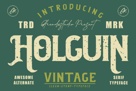
Use Holguin for Bold Web Design
Testing Holguin on a new portfolio homepage felt like finding the right voice for a creative project. The font’s rough texture and bold strokes stood out against a minimalist background, giving the site a confident, modern edge. As a web designer, I always look for fonts that can make a statement without overpowering the layout. Holguin delivers that balance perfectly.
Holguin for Creative Portfolio Headers and Hero Sections
Holguin is a display font that works best when it has space to breathe. On a portfolio homepage, I used it for the main hero title, pairing it with a clean sans serif for the subtext. The contrast between the rough texture of Holguin and the smooth lines of the body font created a visual rhythm that guided the eye naturally. It added energy to the page without making it feel cluttered.
For headers, Holguin’s swashes and glyph variations give a handcrafted feel that fits well with artistic or boutique brand identities. I found that using it for section headings in a digital product landing page helped create a sense of hierarchy while maintaining a cohesive design language.
Holguin for Online Store Banners and Call-to-Action Buttons
When designing an online store banner, I experimented with Holguin for the headline. Its boldness made the message stand out even against a busy image background. I adjusted the spacing and size to ensure readability on mobile screens, which is crucial for e-commerce sites where users often browse on smaller devices.
Using Holguin on CTA buttons required careful consideration. While the font adds a unique flair, it can be too decorative for small text. I opted for a simplified version of the font on the button, keeping the design clean and legible. This approach maintained the font’s personality while ensuring usability.
Holguin for Brand Identity and Logo Design
As part of a brand identity project, I explored using Holguin for a logo. The font’s rough texture gave the brand a rugged, authentic feel that aligned with the company’s mission. I paired it with a subtle background pattern to add depth without competing with the typography.
For a coaching website, Holguin worked well as a header font, adding a personal touch to the site’s tone. It complemented the overall aesthetic without feeling too loud. The PUA encoding allowed me to access all the glyphs and swashes easily, which was helpful when customizing the font for different sections of the site.
Holguin for Blog Graphics and Social Media Content
In a blog redesign, I used Holguin for featured post titles and social media graphics. The font’s boldness made it ideal for headlines that needed to grab attention quickly. I kept the rest of the text in a simpler font to maintain readability across different platforms.
On social media, Holguin added a distinctive visual element to posts and banners. It worked especially well with dark backgrounds, where the font’s texture contrasted nicely with the background. I made sure to test it at different sizes to avoid any issues with clarity on mobile screens.
Holguin for Digital Ads and Campaign Landing Pages
When creating a campaign landing page, I used Holguin for the main headline and supporting text. The font’s presence helped reinforce the message without overwhelming the user. I paired it with a neutral color palette to keep the focus on the content rather than the typography.
For digital ads, Holguin’s boldness made it easy to read from a distance. I tested it on different ad formats and found that it performed well on both desktop and mobile views. The font’s versatility made it a strong choice for campaigns that needed a memorable visual identity.
Holguin for Web Design Projects and Font Pairing
When working on a course sales page, I used Holguin for the main title and paired it with a simple sans serif for the body copy. This combination created a clear visual hierarchy while maintaining a professional look. The font’s texture added character without distracting from the content.
Font pairing is essential when using a display font like Holguin. I recommend balancing it with a more neutral typeface for body text. A serif font could work well for editorial-style content, while a sans serif would suit a more modern, minimalistic design. Testing different combinations helps ensure the final layout feels cohesive and polished.
Holguin for Responsive Layouts and Mobile Optimization
On a responsive layout, I made sure Holguin scaled properly across different screen sizes. The font’s design held up well on larger displays, but I reduced the size slightly for mobile views to maintain legibility. I also tested it on light and dark backgrounds to ensure it remained readable in all conditions.
For image overlays, Holguin’s texture added a layer of visual interest without clashing with the background. I adjusted the opacity and spacing to keep the text clear and easy to read. This approach worked well for promotional banners and hero images that needed a strong visual impact.